Media elements are the things you can add to a page besides text: videos, maps, slideshows, cards, tabs, forms and more. This chapter shows how to add each one and what its settings do.
Adding a media element
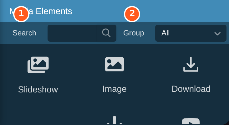
Media Elements is at the bottom of the editing panel.
Search finds an element by name.
Group shows one kind at a time, such as Layout or Multimedia.
To add an element, drag its tile onto the page and let go where you want it. Its settings appear in the editing panel. To change it later, click it on the page.
Which elements you see depends on your website. This chapter covers the common ones. Layout covers columns, blocks, lines and tables, and Adding images covers pictures.
Video
Drag the Video tile onto the page. The Choose Video window opens, with three tabs:
Youtube: search for a YouTube video and click it.
Vimeo: the same for Vimeo.
Local: a video file in your own file library.
Click Select to put the video on the page.
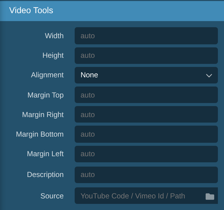
In Video Tools, Description says what the video is about, for people who can't see it. Source is the YouTube code, Vimeo number or file. Click the folder icon to choose a different video.
The size, alignment and margin settings work the same way as for pictures. See Editing images.
YouTube and Vimeo videos only play once a visitor has accepted those cookies. Until then, visitors see a picture of the video with a note about their cookie settings.
Google Map
Drag the Google Map tile onto the page, then click the map to show its settings.

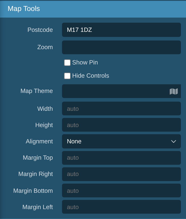
Postcode: the place to show.
Zoom: how close in the map starts. A bigger number is closer. 14 shows a few streets.
Show Pin puts a marker on the postcode. You can then give the pin a title.
Hide Controls removes the zoom buttons.
Map Theme: click the map icon to choose a colour style.
Like videos, maps only show once a visitor has accepted the cookies for them.
Slideshow
A slideshow shows several pictures in turn, each with an optional caption. Drag the Slideshow tile onto the page. It starts with one empty slide.
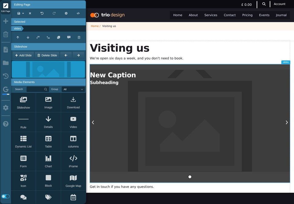
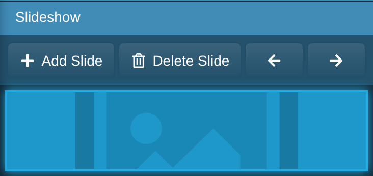
Add Slide adds another slide after the one showing.
Delete Slide removes the one showing.
The arrows move between slides. The picture below them shows the slide you're on.
To change a slide's picture, click it on the page and use the Image Tools, as in Replacing an image. Click the caption to change its words.
Gallery
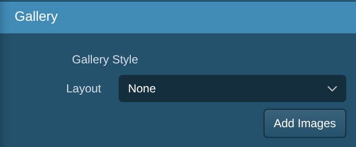
A gallery shows a set of pictures as a grid. Visitors can click one to see it bigger.
Drag the Gallery tile onto the page, then click Add Images and choose the pictures. Layout lists the gallery styles your website has.
Card
A card is a box with a picture, a heading, some text and a button, often used in a row to link to other pages.
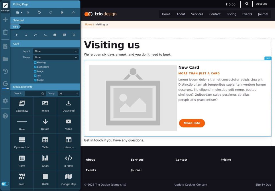
Click the words on the card to change them.
Click the picture to change it.
Click the button and use the link tools to choose where it goes. See Links.
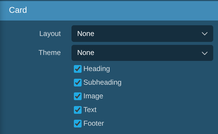
Untick Heading, Subheading, Image, Text or Footer to leave that part out.
Layout and Theme list the card styles your website has.
To put cards in a row, add columns first and put a card in each one.
Tabs
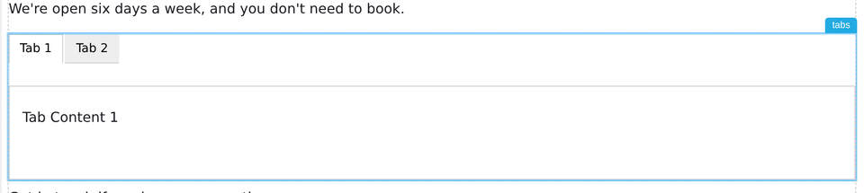
Tabs put several panels of content in the same space, and visitors click a tab to see each one.
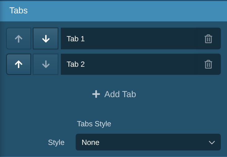
Type in a tab's box to rename it.
The arrows move a tab earlier or later.
The bin deletes a tab and its content.
Add Tab adds another.
To change what's in a tab, click the tab on the page, then click in its content and type.
Details (expanding sections)
A details element shows a heading that visitors click to reveal more. It's good for questions and answers.


Click "Summary Here" to type the heading, and "Detailed explanation here..." to type the hidden part. Open sets whether it starts open or closed.
Alert

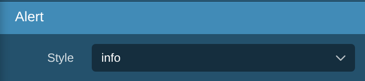
An alert is a coloured box for something visitors mustn't miss, such as a change to opening times. Click its title and text to change them. Style sets the colour, for example info or warning.
Download
A download is a link to a document, such as a PDF or a Word file, with an icon showing its type.
Click where you want the link, then drag the Download tile there.
The File Manager opens at your Downloads folder. Click the file, then Select.
Change the link's words to say what the document is, for example "Price list (PDF)".
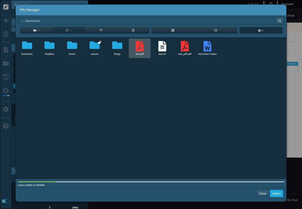

To upload a new document, see The file library.
Form
A form lets visitors send you a message. Drag the Form tile onto the page. It starts with email, name and comments boxes and a Send Form button.
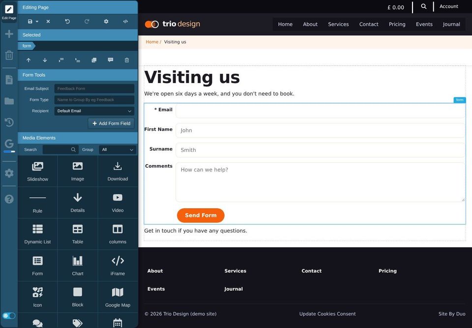
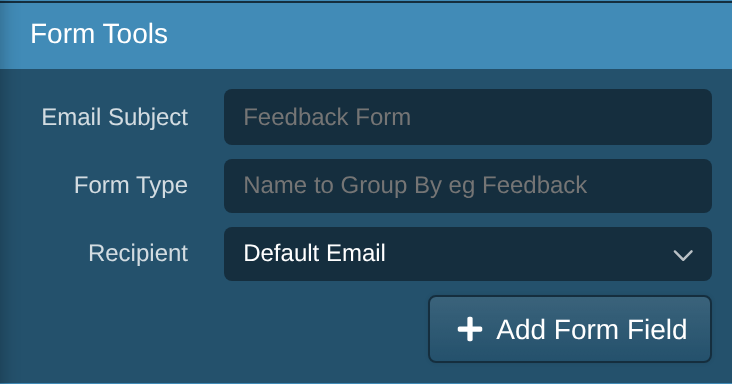
Email Subject: the subject line of the email you get.
Form Type: a name to group the replies by, such as "Bookings".
Recipient: who the replies are emailed to. Your website administrator sets up the choices.
Add Form Field adds another box to the form.
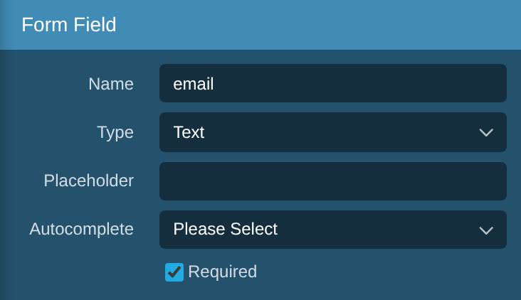
Click a box in the form to change it. Click its label on the page to change the words beside it.
Type: text, a bigger text box, email, phone number, number, date, tick box, dropdown, radio buttons or file upload.
Placeholder: light example text shown in the empty box.
Required: visitors must fill it in before they can send.
For a dropdown or radio buttons, type the choices in Options.
Replies are emailed to the recipient. If your website has the Forms area turned on, they are also kept in the admin area, under Forms.
Popup
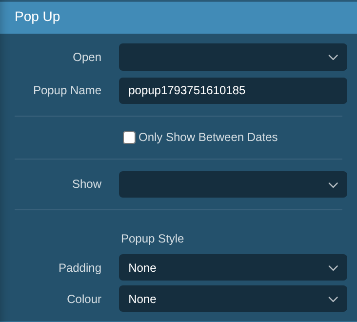
A popup shows content in a window over the page. Drag the Popup tile onto the page and type its content.
Open: when it appears. When the page loads, after a pause, when the visitor scrolls to it, or when they click a link to it.
Popup Name: to open it from a link, link to
#and this name, for example#offer.Only Show Between Dates: for offers that end.
Show: every visit, or only once a day or once a week, so it doesn't annoy people.
Icon
An icon is a small symbol, such as a phone or an envelope, that sits in a line of text. Drag the Icon tile into the text, then search for an icon and click it.
Size, Align and Colour list the choices your website has.
iFrame
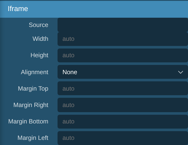
An iFrame shows part of another website inside your page, such as a booking form from another company. Type the address you were given in Source, and set the height so it all fits.
Only use addresses from organisations you trust.
Chart
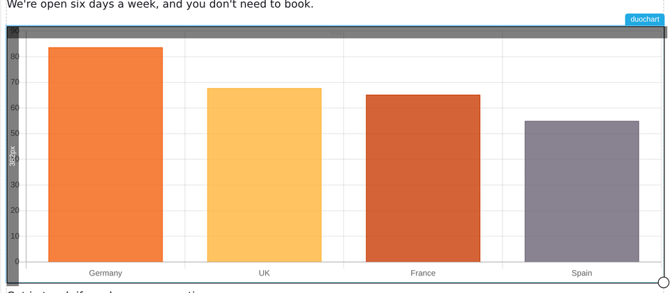
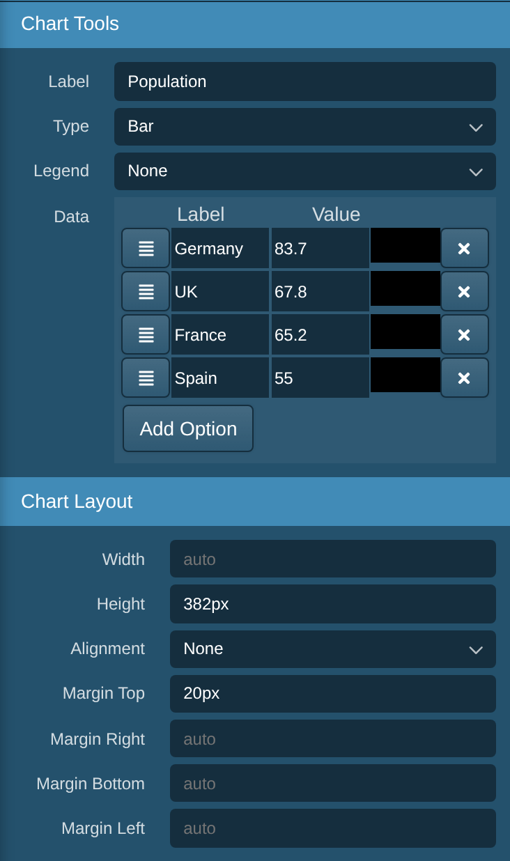
Label: what the numbers are, such as "Visitors".
Type: bar, horizontal bar, line, pie, doughnut or polar.
Legend: where the key goes, if you want one.
Data: one row per bar or slice, with its label, value and colour. Add Option adds a row, and the cross removes one.
Other elements
Your website may have other elements. These are usually set up by your web designer, and you only need to drop them in place:
Snippet: content saved for reuse on several pages. See Snippets.
Dynamic List: a list that fills itself, such as the latest news stories.
Blog Comments, Blog Tags and Blog Months: parts of a blog or news section.
Event Calendar, Booking and Price Tag: events, bookings and shop items.
Forum, Reset Password, Forgot Password and User Details Form: for a members area.
Code Sample and Variable: for technical pages.